Rath Yatra Script Logo PNG – Transparent Calligraphy Design
This one came from a different idea. Instead of bold block text or photo-based graphics, I wanted something that felt like a logo or badge. Clean enough to use as a title, but still carrying festive energy.
Why I Chose a Script Style
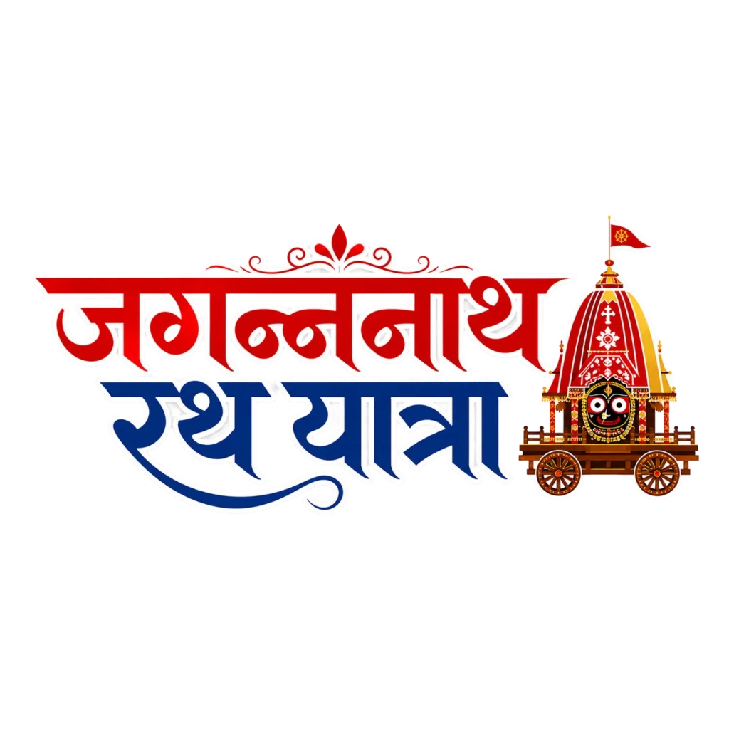
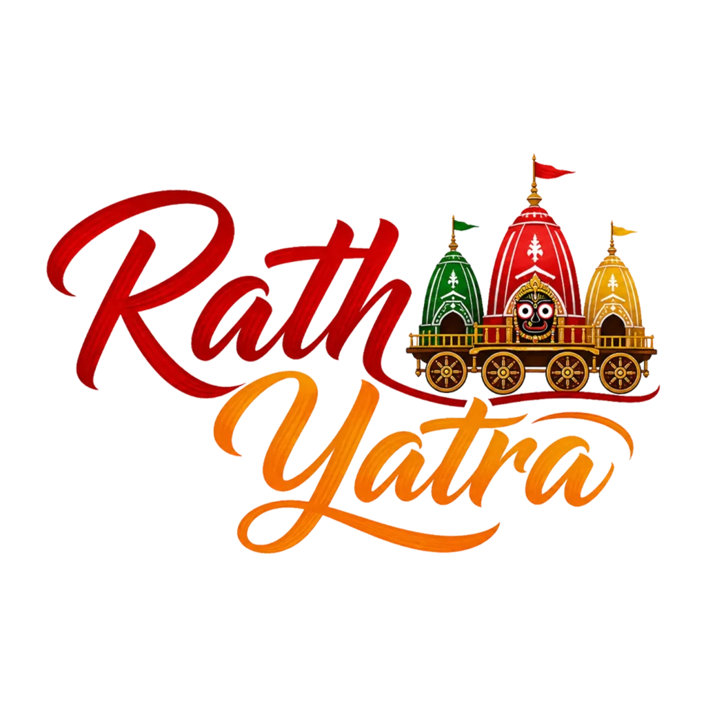
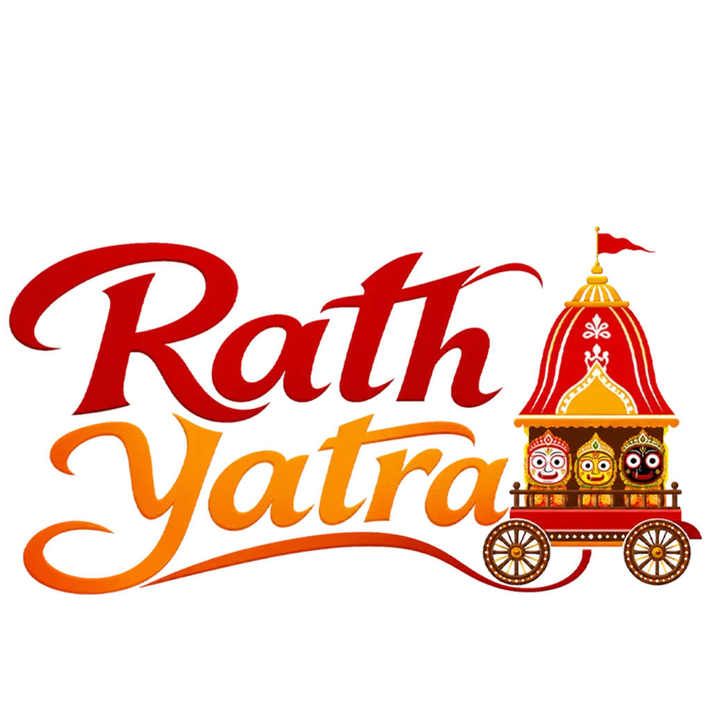
For “Rath” and “Yatra,” I used a flowing calligraphy font. Not a standard block letter. The red-to-orange gradient moves smoothly through both words. This gives it a warm, hand-lettered feel instead of a stiff, printed look.
I added a sweeping underline beneath “Yatra.” This ties both words together visually. It gives the piece a finished, signature-like quality.
A bold serif design shouts “announcement.” This script style feels more like a title or logo mark. Something you’d use to brand a post or video series, not just label one graphic.
The Illustrated Chariot Icon
This time, I illustrated a simplified chariot icon instead of using a photo. It still keeps the key details. The red-and-gold temple-style canopy. A small flag on top. All three deities visible inside, seated in their traditional positions.
I kept the illustration clean and iconic. Not highly detailed. This way it reads clearly even at small sizes, like a profile picture or a small thumbnail badge.
Why I Designed It This Way
Photo-based designs work well for one-time posts. But a script logo like this is built for reuse. You could use it across multiple posts throughout the festival period. It works almost like a mini-brand for your Rath Yatra content specifically.
Where I’d Use This
- As a recurring title graphic across multiple Rath Yatra posts
- Instagram highlight covers or story series about the festival
- YouTube channel branding for Rath Yatra-themed videos
- A small badge or watermark on other Rath Yatra posters
- Profile picture overlays for temple or community pages during the festival
How to Use This PNG
This is a transparent PNG, so there’s no editing required. Just place it directly onto any background, photo, or video. The design is compact and horizontal. This makes it work well in banner-shaped spaces, like YouTube channel art or Instagram highlight covers, where a full poster wouldn’t fit.
What Makes This Different From My Other Rath Yatra Designs
I already have a bold typography piece and a full poster design for Rath Yatra 2026. This one fills a different gap. It’s smaller, reusable, and logo-like, rather than a standalone announcement graphic.
If you’re posting multiple times during the festival, this gives your content a consistent visual thread. No need to reuse a full poster every time.