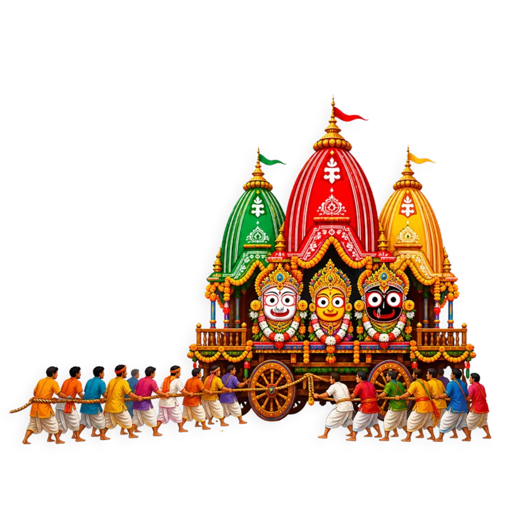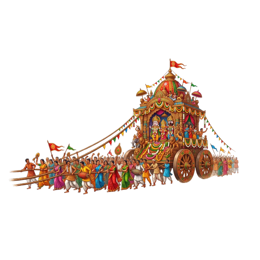
I spent longer on this one than any other Rath Yatra design I’ve made. Every other piece in this collection shows the chariot standing still, but that’s not actually what Rath Yatra feels like. It’s noise, movement, and hundreds of people pulling on the same rope at the same time. I wanted to draw that moment instead of just another static chariot graphic.
Why a Static Chariot Wasn’t Enough
If you’ve ever seen a Rath Yatra procession, either in person or on video, you know the chariot barely looks like it’s moving. It’s massive, and it takes an entire crowd pulling together just to inch it forward. That struggle, that shared effort, is actually the heart of the festival. A clean, still chariot graphic misses that completely.
So instead of designing another poster with the chariot parked in the center, I drew the pull itself. The ropes stretched taut. The crowd leaning into it. Some people mid-step, some frozen in a cheer, a couple clearly mid-dance because that happens too during Rath Yatra, people genuinely celebrating while they pull.
Getting the Chariot Right
I didn’t want to take creative liberties with the chariot structure itself, since that part actually matters to people who know what it’s supposed to look like. The dome canopy, the guardian lions at the base, the carved elephants supporting the platform, the layered flags and bunting, all of that follows how the real chariots are built for the Puri procession. The three deities sit inside under the archway, garlanded, in the same seating order they’re traditionally shown in.
Why the Crowd Took the Most Time
Honestly, the chariot was the easy part. Drawing one detailed object is straightforward. Drawing fifty people who each look like an individual person, not a copy-pasted crowd, is a completely different problem.
I gave everyone different colors, blues, greens, pinks, mustard yellows for the sarees, white and orange dhotis for the men, so the eye doesn’t catch on any repeated pattern. Then I varied what they’re actually doing. Not everyone is just pulling a rope with a blank expression. Some are mid-dance. A couple are playing dhol. A few just have their arms thrown up, celebrating rather than working. That mix is what makes a crowd feel real instead of duplicated.
Where I’d Actually Use This
This one works best anywhere you want to show the scale of the festival, not just label it. A few honest use cases:
- A website banner for a temple page, something that fills the whole top of the screen
- A YouTube thumbnail if you’re covering an actual Rath Yatra event, since it has real visual energy compared to a plain text thumbnail
- A printed backdrop or standee for a local procession, if your community is organizing one
- Anywhere you’re trying to explain what Rath Yatra actually looks like to someone who’s never seen it
A Quick Note on Using It
It’s a transparent PNG, so no editing tools are required, just drop it onto whatever background you’re working with. Because it’s a wide horizontal image, it fits banner spaces and headers much better than square post formats. If you’re adding text, keep it toward the top, the crowd section at the bottom is busy enough that text tends to get lost in it.
How This One’s Different From the Rest
Everything else I’ve made for Rath Yatra so far, the logo, the bold text, the poster, is built to label a post or announce the occasion. This is the only piece that actually tries to show what the day feels like. If someone asked me which one to use to genuinely represent the festival visually, this is the one I’d point to.