Rath Yatra 2026 Bold Text PNG – Transparent Typography Design
When I designed this one, I didn’t want another festival poster with a background and text on top. I wanted something bold enough to stand on its own. But flexible enough that anyone could drop it onto their own photo or video.
My typography choice
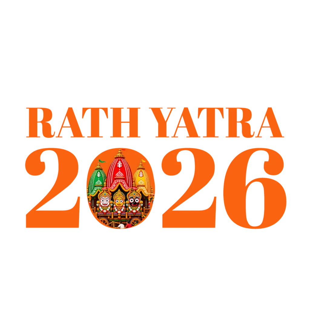
For “RATH YATRA,” I picked a high-contrast serif font. Thick vertical strokes, thinner horizontal ones. This gives the lettering a formal, traditional feel. A rounded or modern font wouldn’t fit here — this is a religious occasion, not a casual event.
I chose saffron-orange for the color. This isn’t random. Saffron carries real meaning in Hindu tradition. It represents purity and spiritual devotion. You’ll see this same tone on temple flags and priest attire. I wanted the color to say “sacred” before anyone even reads the text.
The detail I’m proudest of
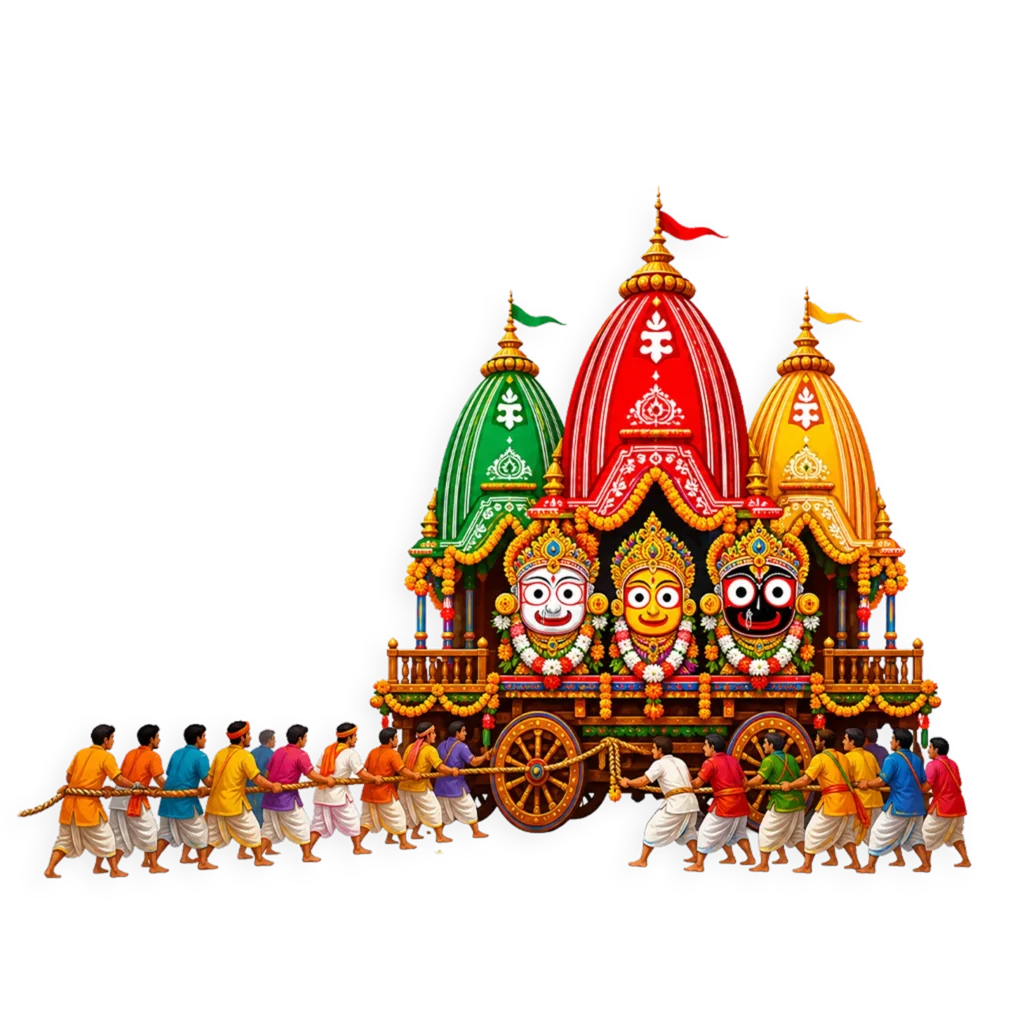
I didn’t leave the “0” in “2026” as a plain shape. Instead, I placed a real photo inside it. You can see all three chariots — Jagannath’s in red-and-gold, Balabhadra’s in green, Subhadra’s in yellow. Garlands, devotees, the ropes — all real.
Many festival graphics use illustrated or AI-generated chariots. These often don’t match the real look of Puri’s Rath Yatra. I wanted this design to feel authentic instead. Something tied to the actual event, not just a template with the right words.
Why I made it transparent, not a poster
Not everyone needs a full background. Sometimes you already have your own photo or video. You just need clean text on top. That’s why I built this as a transparent PNG instead of a fixed poster.
You can drop it into Canva, CapCut, or any basic editor. Resize it, place it anywhere. It blends into any background color with no white edges.
How I designed it to be used
I made the text bold enough to read clearly, even at small thumbnail sizes. For Reels and Shorts, transparency lets it work over moving video without re-editing per clip.
For WhatsApp Status or Instagram Stories, try placing it over a solid saffron, maroon, or cream background. This keeps the palette consistent.
If you run a temple or community page, layer it directly onto your own event photos. And since it’s high-resolution, it holds up fine for small printed flyers too.
The gap I was trying to fill
Not every project needs a full illustrated poster. Many creators already have their own visuals. They just need something that instantly reads as “Rath Yatra 2026,” without replacing what they’ve already built.
That’s the gap this design fills. A clean, culturally accurate label you can add to your own content.