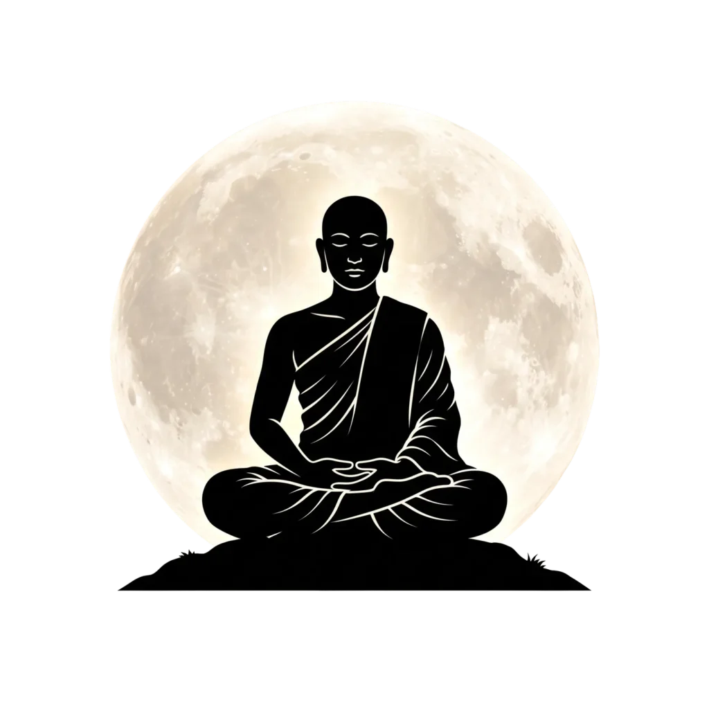
A solid black silhouette seated in meditation, framed against a realistic, almost photographic full moon. That’s the entire visual concept here, and it works precisely because of what it leaves out rather than what it includes. No facial detail beyond closed eyes and calm, simplified features. No robe texture beyond a few clean fold lines running down the shoulders and crossed legs. Just a dark, solid shape holding perfect stillness, set against a moon that looks genuinely lunar rather than illustrated.
Why Contrast Does the Heavy Lifting Here
This is a real departure from the flat-color illustration style used elsewhere in this collection, the detailed Rath Yatra chariots, the warm-toned devotional figures. Combining a flat black silhouette with a realistic, textured moon creates a deliberate visual contrast: hand-drawn simplicity set against natural, almost photographic detail. That contrast does more work than either style would achieve alone. A fully illustrated monk against a flat moon would feel decorative. A photo-realistic monk against the same moon would feel like stock photography. This in-between approach, one element abstracted, one element realistic, gives the piece a quiet, almost cinematic mood that neither extreme quite manages on its own.
The Moon Isn’t Just Background Decoration
Guru Purnima falls specifically on the full moon day of the Hindu month of Ashadha, so pairing a meditating figure directly against a full moon ties this image to the exact astronomical event the festival is built around, not just a general, loosely spiritual idea. Someone familiar with the festival’s timing will recognize that connection immediately. Someone unfamiliar with it still reads the image correctly as calm, reflective, and spiritually significant, since a monk in meditation under a glowing moon carries that meaning across most cultural contexts, not just one specific tradition.
Where Silhouette Style Works Best
Silhouette-style artwork like this tends to succeed in contexts where mood matters more than specific cultural detail. A yoga app’s splash screen, a meditation guide’s cover image, or a spiritual quote layered directly on top of the image, all of these lean on atmosphere and stillness rather than requiring viewers to identify specific religious iconography or symbolism.
Practical Notes on Scale and Backgrounds
Because the entire image reads as one solid dark shape against a bright circular moon, it holds up remarkably well even at small sizes, app icons, profile pictures, or small thumbnail previews, situations where more detailed, multi-colored illustrations often lose clarity or start to look muddy. The transparent background lets you place this on dark, light, or colored backdrops with equal ease, though it naturally reads best against darker tones, since those let the moon’s glow stand out rather than compete with a busy backdrop of its own.