Guru Purnima Text PNG – Brush Lettering Design
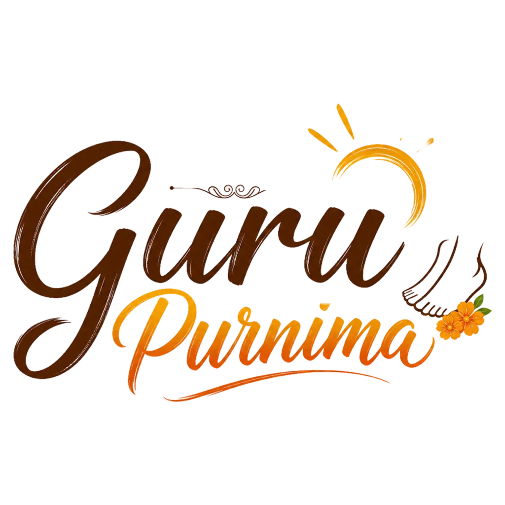
Two words, hand-lettered in a loose brush style, “Guru” in dark brown, “Purnima” fading from orange into gold. That’s the core of this design, closer to a logotype than an illustration, built for anyone who needs bold, expressive text without any surrounding scene or background.
A small sun icon sits above the words, brushed in the same loose, gestural style as the lettering itself, with a few thin light rays extending outward. Below and to the right, a small foot symbol appears, accompanied by two marigold blossoms, a compact nod to the tradition of touching a guru’s feet, included here without needing a full illustration to convey it. A thin decorative flourish separates the sun from the text below, adding a bit of ornamental detail without cluttering the composition.
The brush-stroke lettering style sets this apart from both the sticker badge and the formal seal already in this collection. Where those two lean structured and symmetrical, this one feels loose and energetic, more like a hand-painted banner headline than an emblem or badge. The color transition from brown to orange-gold across the two words also adds visual movement, guiding the eye naturally from top to bottom.
Because this is primarily a text graphic rather than a full scene, it works best as a headline element rather than a standalone post. Think YouTube thumbnail titles, the top of a Guru Purnima blog banner, a title graphic overlaying a photo background, or a header for a printed program. Its horizontal, text-forward layout doesn’t suit a small square sticker format as naturally as the badge design does, but it excels anywhere a bold, readable title is the priority.
As a transparent PNG, place it directly over a photo, background PNG, or solid color. Since the lettering already carries strong color contrast on its own, it holds up well against both light and darker backdrops without losing legibility.